
A self-review view for the League Next client
A look at a gap I think exists in how players see their own growth, and one way it might be closed.
The single strongest experience League provides to me is development and growth of skill, more so than ranked grind and LP. For most players, these are synonymous, which is why so many use third party overlays and applications. This is a design exercise in implementing the analytical side of the data the API exposes into League Next, and not implementing the real time decision making data. The League client already shows me most of the numbers third part applications do. It shows them one game at a time, at the end of the match, on a scoreboard next to nine other people. I think that's a hard moment and a hard framing to learn from, and part of why players who want to improve go outside the client, into tools Riot has been drawing tighter lines around. League Next is rebuilding the client as part of the game, which seemed like the right time to ask where a player's own personal skill growth could live in it. This is one answer: a Review view in the profile, reached through a single line on the post-game screen, that compares you to your own recent games first, your rank second, and your teammates never. It's a proposal, not a verdict. The first thing I'd want to know is whether it helps at all: whether players who open it move the stat they're looking at over their next twenty games, and whether opening it after a loss makes anything worse.
What I don't know
- What's here comes from building and shipping my own games and small scale professional tools, where every screen is mine, and from fifteen on and off years of playing very average League.
- I have no player research. The evidence is my own habits, friends' anecdotes, and what the client shows. I've tried to be clear about which claims rest on which.
- I don't know why Riot has left this to third parties. Section 4 is guesses, and some are probably wrong. It's possible this has been built internally and shelved for reasons I can't see.
- I don't know which numbers are the best signals of improvement for each role. That's a game-design and data-science question. I used the client's existing stats as stand-ins so the interface could be drawn at all.
- I don't know what the League Next client looks like. The reveal hasn't happened. Any of this could be superseded the day it does.
- I don't know whether seeing your own trend actually helps a player improve, or just makes a bad night worse. That's the question the whole thing turns on, and it's the first test I'd run.
1. What the client already shows
I went through every place I could find where the client shows me a number about my own play.
| Where | What | When | Compared to |
|---|---|---|---|
| Post-game scoreboard | Kills, deaths, assists, CS, gold, damage, vision score, kill participation, wards | Right after the match | The other nine players |
| Post-game graphs | Gold, experience, and damage over the course of the game | Right after the match | Both teams |
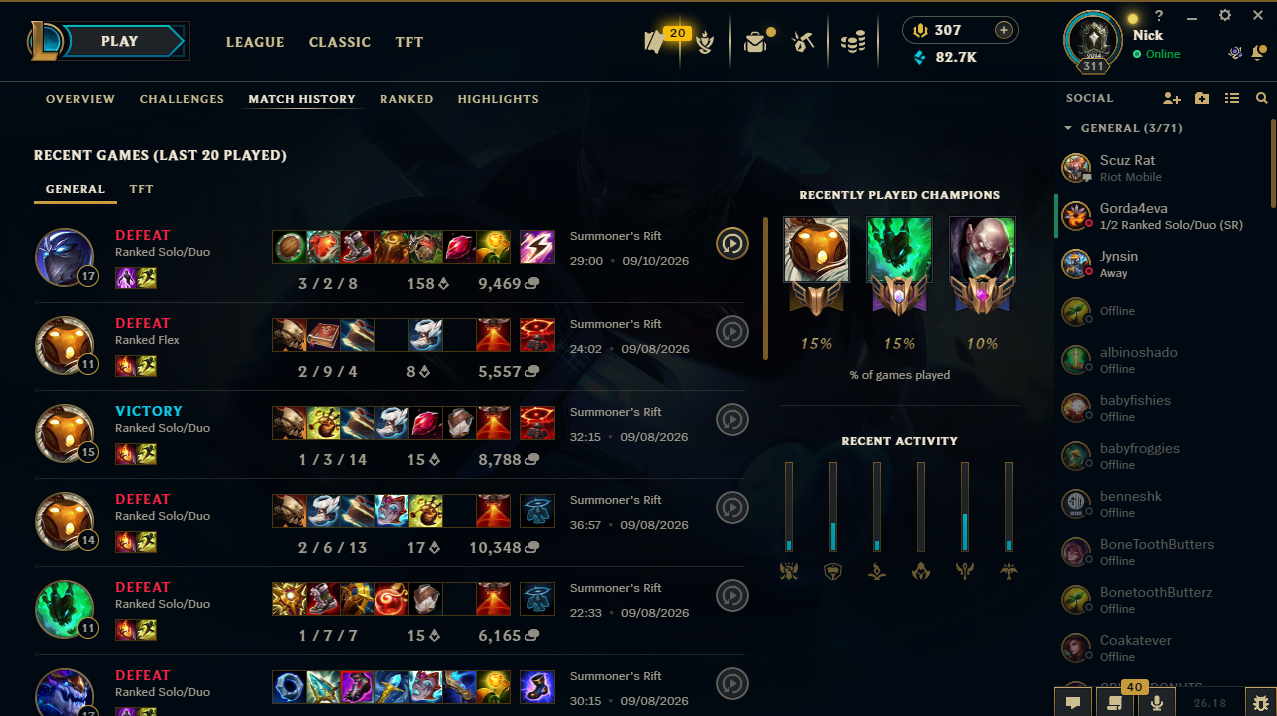
| Match history | The same scoreboard, per game, going back weeks | Whenever you open it | The other nine players, one game at a time |
| Challenges | Lifetime progress toward tiers across categories | Whenever you open it | Tier thresholds |
| Eternals | Per-champion counters with milestones and personal bests, sold per champion | Loading screen, champion page | Your own milestones, shown to everyone in the lobby |
Everything I found is either a single game or a lifetime total. Nothing sits in between. There's no view of my last twenty games on Thresh, no trend, no way to tell whether the thing I've been working on is working. The numbers exist. My read is that they're shown at the wrong moment, at the wrong scale, and against the wrong people. The rest of this page tries to make that case rather than assume it.
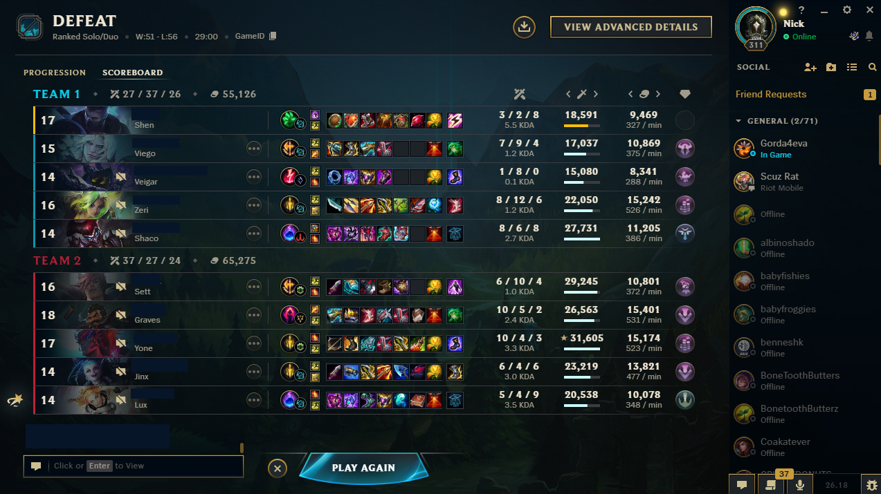
Which is why I think third party applications and overlays are so popular. I, and most people I play with, use a second monitor and/or an in game overlay to fill in information gaps.
2. Why now
Riot announced in December 2025 that most of the League team is working toward 2027: a new client fully integrated with the game instead of a separate application, a visual overhaul of Summoner's Rift, changes to runes and pre-game choices, and an overhaul of the new player experience. The client reveal is still pending. That made it seem less useful to ask whether a stats view belongs in the current client than to ask what belongs in one being rebuilt from scratch, where post-game and profile are the same application as the match.
I also think self-review and onboarding might be one surface at two skill levels: a view that tells a Plat support his vision is trending down could be the same view that tells a new player what to try next game. I'm less sure of that than of anything else here, and it's not something I've designed for below.
3. Constraints
Riot has already said, in public, what it thinks belongs in a tool like this. Its third-party policy allows features that help you review and improve your own play and restricts features that surface hidden information about opponents: enemy ultimate timers were banned in March 2025, and summoner names are obfuscated in ranked champion select. In May 2025 it prohibited third-party ads in overlays, loading screens, and the Riot Client, and required that tools not mimic Riot's UI, alter objectives, or remove decision-making from the player. I took those as my constraints too.
I added four of my own.
Only numbers the client already shows. I'm not inventing a stat. I'm moving the ones that exist to a different moment.
Only you can see it. Nothing in this view is visible to teammates or opponents. It's opt-in and it can be turned off.
You first, your rank second, your teammates never. The primary comparison is your own last twenty games. Your rank's typical range is shown as muted context. That range is a data-science dependency, and the design has to work without it.
No advice. The view shows the gap. What to do about it is the player's decision. A coaching feature would be a different and harder problem, and it's close to the kind of thing Riot's policy is wary of.
4. Why this might not exist yet, and where it could live
Three guesses, not claims. Tone: Riot avoids telling players they're bad, rightfully so, since bad is purely relative. A stats view framed the wrong way does exactly that. Ecosystem: Riot deliberately enables third-party tools through a public API, and letting them carry this keeps the client lean. Vessel: the current client may never have been the right place for it. If the third is true, League Next answers it. The framing rule is my attempt at the first. On the second, I'll take a position: the core loop of seeing your own trend belongs in-client, in Riot's tone and under Riot's policy, and the depth can stay outside.
| Where it could live | For | Against |
|---|---|---|
| Post-game, as a new tab | The traffic and the emotion are here | A hard moment for comparison; the screen is already dense |
| Profile, as a new view | Reflection happens here; it persists | Few people open the profile; out of sight |
| Champion page | The natural home for per-champion numbers | Splits the picture by champion before you see the whole |
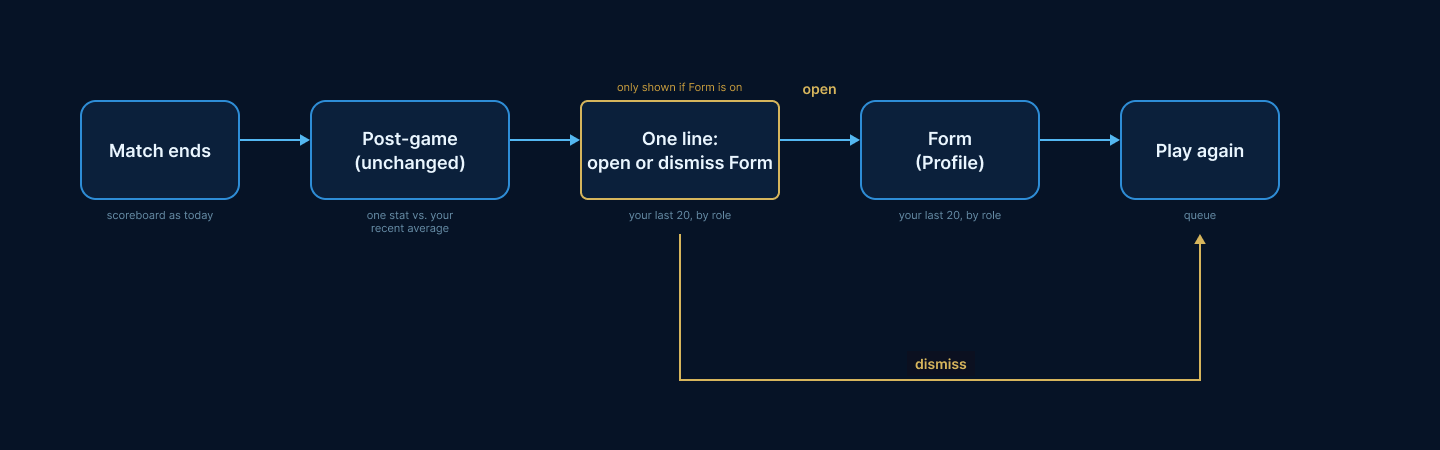
My pick is profile as the home, with one line on the post-game screen as the only door. Post-game has the traffic and the emotion, which is exactly why I don't think the view should live there. The profile is where reflection happens, which is exactly why it needs a door from post-game or nobody finds it. The post-game screen itself doesn't change. Open-rate data could talk me out of this
5. The design
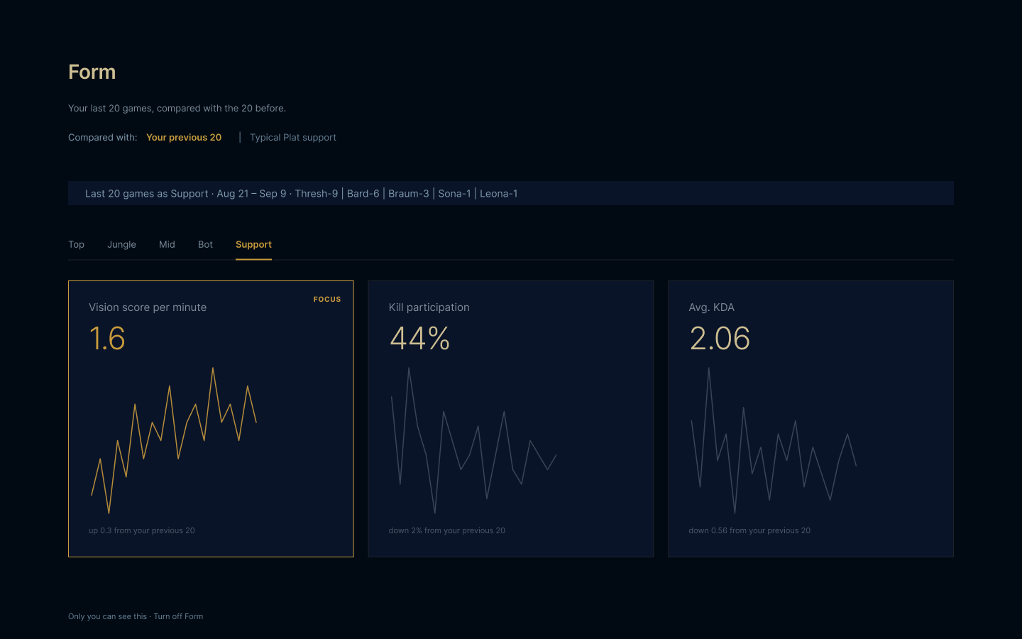
Role first, because the same number means different things by role. Three stats per role, chosen from what the client already shows, each with its twenty-game average, a small line of the last twenty games, and the change from the twenty before that. One card is marked as the focus: whichever stat moved most, in either direction. Not on this screen: LP, win rate, or anyone else's numbers. Your rank only appears as the shaded band on the focus card.
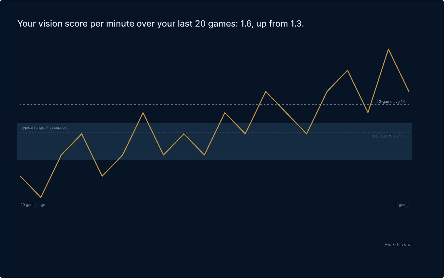
The sentence at the top is what the card is for: "Your vision score per minute over your last twenty games: 1.6, up from 1.3." The line under it is those twenty games. The shaded band is the typical range for your rank and role, and it's deliberately unlabeled beyond that. It's meant as context, not a grade, and it's the one element that depends on data science; if the baseline isn't ready, the band isn't drawn and the card still works. A player can hide any stat. Nothing on the card tells them what to do.
One line, because the post-game screen is already the densest screen in the client and, I think, a hard moment to be told anything. The line names one stat from this game against your recent average and offers the door. Dismiss it and it's gone. Nothing on the post-game screen moves.
6. Tradeoffs and what I'd test
Which stats show per role is a game-design decision, not a UX one. Vision score means something different for a support and a jungler; kill participation punishes a split pusher for doing their job. I picked three per role for the wireframes and I'd expect that list to change the first time someone from the balance team looks at it. Cohort baselines are a data-science dependency, and the design assumes they might not exist at launch. I'd also expect someone who lays out screens for a living to see problems with these that I don't.
The framing rule reduces the damage of seeing a bad number. It doesn't eliminate it. A player opening this thirty seconds after a loss is the case I'd watch most closely. And the pull toward "just show more" is the thing that turns a review view into a second scoreboard; three stats per role is a discipline, not a limit of the layout.
Measures: how many players open it at all; whether players who get it move the focus stat over their next twenty games compared with a holdout group who don't; and dodge or report rates after viewing post-loss against baseline. The first A/B I'd run is trend-first against cohort-first framing on the focus card.
7. What I cut
An in game overlay. That's the asymmetry zone, and it isn't the client. Teammate and opponent stats, which are the flame vector and run against the direction Riot's policy has been moving. Advice, for the reasons above. A champion drill-in, for now; it's the obvious next screen, but it splits the picture by champion before the player sees the whole, and the overview has to earn its place first. A settings screen, because one sentence covers it: only you can see this, and you can turn it off.
8. If this were real
Before building anything: interviews with players who use overlays and players who tried them and quit, a data-science partner for the baselines, and game design to pick the per-role stats. Stage it opt-in, one role, one metric set. Kill it if the players who open it don't move the number, or if opening it after a loss makes people leave. And I'd expect whatever shipped, if anything did, to look different from these wireframes.
If the gap doesn't exist, or exists for reasons I've missed, that's the more useful thing for me to learn.
Sources
Riot Developer Portal, third-party application policies. Riot Games, League of Legends 2027 announcement, December 2025. Riot Games, third-party policy updates, March and May 2025.